How would the world look like without logos? Like a place without character, colour and style. There isn’t a single known enterprise or organisation worldwide without a distinguishable logo. And that has a reason. Remarkable logos allow our brain to easily remember a brand. Look around you and count the logos which you can see. If you did not count more than ten, you are either in a dark room or need new glasses. We have counted thirteen around us. However, you wouldn’t have noticed them, if we hadn’t invited you to do so. That’s because there are simply too many symbols around us – scientists claim our brain can only process 7 things at once. It won’t be able to process more, especially when you are engaged in something else.
This is why you need a unique logo. A sign so different from the others, so outstanding, that no one can oversee it. Down below, we collected several tips for you.
(Please note: it’s not always necessary to follow all these tips. Often a combination of three, four, or five tips is fair enough. If you integrate all tips, the logo can be overwhelming to some extend)
Do you want to find out how succesful the enterprise behind our logo is? More from us here!
1. Create a personal logo
The most important tip right at the beginning. What is more unique than your personality, your personal qualities and interests? Most logos have letters, a little bit of grey and the companies name. Often, that’s everything. What we all miss in business life is warmth. We miss the emotional part. We miss individuality. As a result, if you create a logo with a personal background, you will indicate that your enterprise is different. That your project is unusual. That you care about the individual consumer. Another major benefit is that the logo will automatically differ from the other ones – just as you do.
But how can this personal note look like? It could be a symbol, a picture or a drawing. It’s crucial not to convey your message too subtle. The viewer doesn’t need to understand the message. However, the viewer should understand that there is a message.

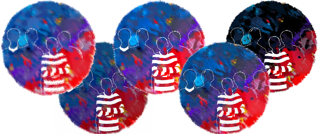
We chose a photograph of us and edited it. Around that, we build our original logo. The photo symbolises our incessant work as a team and our powerful friendship. If you work as a nature photographer, why don’t you use your favourite picture? Do you run a Thai restaurant? Why don’t you paint an impressive drawing of your favourite dish? There are no borders for your creativity and no limitations for your individuality. And another benefit: Every time you watch your logo, you remember yourself.
2. Use the beautiful effects of colours
Try counting the number of shades around you. It’s impossible! According to the hexadecimal definition of colours, there are exactly 16.777.216 ones. But this definition is digital. In our analog world, diversity is endless. Hues enrich our lives even more than logos. And they help us remember. Let’s say a car completely identical in construction to yours would drive next to you somewhere in the city. But different colours allow you immediately to distinguish. Would you recognize water if it was coloured greenly or would you interpret it as poison? You see: colours determine our lives. Logos skilfully use this principle. Which brand is bright yellow? McDonald’s! Which brand is deep blue? Nivea! Similarly, the principle of flags is based on the retentiveness of colours.

We recommend between two and four colours. Optimally, use strong contrasts and combine different colours using gradients. What’s more, play with the intensities and the brightness until you feel that it’s accurate. However, logos never consist solely of colours. Instead, they should serve to underline the eyecatcher (e.g., the burger-king-burger).
3. Your logo needs a highlight
A good logo has two parts: The highlight and the environment around it. Think about Adidas: On one side there is the lettering embedded in colours, on the other side, there are the three famous strokes. Undeniably, this logo is very recognizable. But what would the Adidas logo be without strokes? Nothing special. The speciality gives the logo some kind of extra kick. Thus, the logo is even more conspicuous.
In the middle of our logo is a striped T-shirt. Frankly, this was not planned and nothing more than a lucky coincidence. The boy might look like a crazy convict. But would you forget the logo soon? Probably not – mission accomplished.

There are no borders for the style of your highlight. Use your full creative potential! But never forget: The highlight isn’t the same as your special, personal note. Although both things can overlap, the personal message is more the overall thing. The highlight is something special, hidden within the message. Your logo should have a speciality and an environment surrounding it, which stresses the centre. Both of these should sum up to your individual message.
4. Develop a pattern
Our brain loves colours, dogs or cats, and patterns, even if they don’t exist. Our brain is addicted to categorizing and sorting. Moreover, it’s thankful for populism due to its elementary black-white-thinking. There is nothing in nature that would differentiate between Tuesday and Saturday. In nature, a construct like a week does not exist, but our pattern-loving-brain has introduced it already thousands of years ago. Nothing is completely coincidental, even if your surroundings are a terrible mess. Now we will use this principle cleverly for our logo:

How can this pattern look like? Again, the Adidas stripes or the four Audi rings come into our minds. These are good examples and the best examples of how patterns and highlights can be identical. However, this is not completely necessary – take a look at the Google logo. At first glance, you wouldn’t notice the pattern, but it exists. Google developed their own font, which allows the letters to be in perfect combination to each other. Look at how the word Google is written here, using this font. It does not have much style, because the letters don’t perfectly relate to each other. Another elegant example, which combines all the tips above, is the Huawei logo. 8 stripes (pattern and highlight) in eight different shades of red (playing with colours). Eight different shades are combined to a lotus blossom (personal context, origin of Huawei). Beautiful!
5. Avoid surrealism and mind compactness
Logo creation is art, genius art. But it has to be reproducible for industry and even more important for our brain. You need the ability to associate with it. Remember the apple logo. It’s – surprise! – an apple and we can associate it easily. Your design needs to find a compromise between creativity and memorability. Otherwise, the watcher’s brain will simply turn off, especially somewhere in the streets where the brain is already busy with traffic. A glance should be enough to remember the central parts of your logo.
Do you know the logo of United Colors of Benetton? It has ordinary unformatted lettering above an ordinary green colour. It follows nearly none of our tips. Nevertheless, it is famous. Its lack of speciality makes it special. However, if everyone did it that way, it would not be famous. Next, we will show you how to follow our tips and achieve compactness.

The first thing to think about is individuality. Draw something, photograph something, do whatever you like, edit it, and put the result in the middle of your screen. Then divide what you have into two areas: speciality and environment. Decide which parts of the picture are already special. If there is no speciality somewhere, add one. If there is too much speciality, erase it. Add patterns. Optimally you design your logo in black-white at this stage. After the highlighted area and the patterns are finished, think about the background. Ponder upon the colours. Which colour can highlight the centre even more? What colours fit the best? Your possibilities are endless. Now closely observe your work. Do you think everything fits together or not? If not, start right from the start.
6. Avoid text art
Well, we mentioned Google, didn’t we? It’s a great example of how text art can work, but these examples are rare. Text art isn’t unique. You can create it with every Word-Document and it’s simply boring. If you can’t avoid text, make it as simple as possible.

Summing up
We hope you enjoyed our tips and learned something about the addictions of our brains. The whole marketing industry (to which logo designs belong) is based on psychological weaknesses of our brain. We simply can’t oversee colours, patterns, and references to our own life.
It’s necessary to emphasize that our tips are just tips and not a guideline. There are successful examples of logos that simply don’t care about this blog. But the tips offer good orientation points. Often, it’s fair enough to just follow a handful of these tips. We believe the best way to achieve the highest success is to try, not following any rules, just following your instincts. Just start without minding any tip. After your masterpiece is completed, come back here and use this blog entry as a checklist. We wish you great luck and hope that we can see your logo soon somewhere in the streets. Hopefully, we will never forget it!
Do you want to see more epic grafics? Our genious pictures here!
Do you want to read more blog post by us? Our last post here!
0 Kommentare